Plotting
Plotting functions for data visualization.
Scatter plots
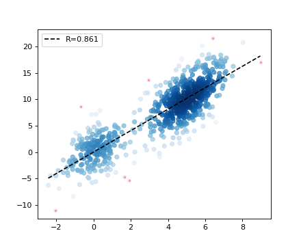
Correlation plot
-
hilearn.plot.corr_plot(x, y, max_num=10000, outlier=0.01, line_on=True, legend_on=True, size=30, dot_color=None, outlier_color='r', alpha=0.8, color_rate=10, corr_on=None)[source]¶ Correlation plot for large number of dots by showing the density and Pearson’s correlatin coefficient
- Parameters
x (array_like, (1, )) – Values on x-axis
y (array_like, (1, )) – Values on y-axis
max_num (int) – Maximum number of dots to plotting by subsampling
outlier (float) – The proportion of dots as outliers in different color
line_on (bool) – If True, show the regression line
legend_on (bool) – If True, show the Pearson’s correlatin coefficient in legend. Replace of corr_on
size (float) – The dot size
dot_color (string) – The dot color. If None (by default), density color will be use
outlier_color (string) – The color for outlier dot
alpha (float) – The transparency: 0 (fully transparent) to 1
color_rate (float) – Color rate for density
- Returns
ax – The Axes object containing the plot.
- Return type
matplotlib Axes
Examples
>>> import numpy as np
>>> from hilearn.plot import corr_plot
>>> np.random.seed(1)
>>> x = np.append(np.random.normal(size=200), 5 + np.random.normal(size=500))
>>> y = 2 * x + 3 * np.random.normal(size=700)
>>> corr_plot(x, y)
(Source code, png)
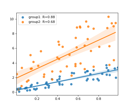
Regression plot
-
hilearn.plot.regplot(x, y, hue=None, hue_values=None, show_corr=True, legend_on=True, **kwargs)[source]¶ Extended plotting of seaborn.regplot with showing correlation coeffecient and supporting multiple regression lines by hue (and hue_values)
- Parameters
x (array_like, (1, )) – Values on x-axis
y (array_like, (1, )) – Values on y-axis
hue (array_like, (1, )) – Values to stratify samples into different groups
hue_values (list or array_like) – A list of unique hue values; orders are retained in plotting layers
show_corr (bool) – Whether show Pearson’s correlation coefficient in legend
legend_on (bool) – Whether display legend
**kwargs – for seaborn.regplot https://seaborn.pydata.org/generated/seaborn.regplot.html
- Returns
ax – The Axes object containing the plot. same as seaborn.regplot
- Return type
matplotlib Axes
Examples
>>> import numpy as np
>>> from hilearn.plot import regplot
>>> np.random.seed(1)
>>> x1 = np.random.rand(50)
>>> x2 = np.random.rand(50)
>>> y1 = 2 * x1 + (0.5 + 2 * x1) * np.random.rand(50)
>>> y2 = 4 * x2 + ((2 + x2) ** 2) * np.random.rand(50)
>>> x, y = np.append(x1, x2), np.append(y1, y2)
>>> hue = np.array(['group1'] * 50 + ['group2'] * 50)
>>> regplot(x, y, hue)
(Source code, png)
Curve Plots
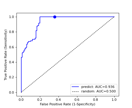
Receiver operating characteristic curve
-
hilearn.plot.ROC_plot(state, scores, threshold=None, color=None, legend_on=True, legend_label='predict', base_line=True, linewidth=1.5, label=None)[source]¶ Plot ROC curve and calculate the Area under the curve (AUC) from the prediction scores and true labels.
- Parameters
state (array_like, (1, )) – Label state for the ground truth with binary value
scores (array_like, (1, )) – Predicted scores for being positive
threshold (float) – The suggested threshold to add as a dot on the curve
outlier (float) – The proportion of dots as outliers in different color
color (string) – Color for the curve and threshold dot
legend_on (bool) – If True, show the Pearson’s correlatin coefficient in legend
legend_label (string) – The legend label to add, replace of old argument label
base_line (bool) – If True, add the 0.5 baseline as random guess
linewidth (float) – The line width
- Returns
(fpr, tpr, thresholds, auc) (tuple of values)
fpr (array) – False positive rate with each threshold
tpr (array) – True positive rate with each threshold
thresholds (array) – Value of all thresholds
auc (float) – The overall area under the curve (AUC)
Examples
>>> import numpy as np
>>> from hilearn.plot import ROC_plot
>>> np.random.seed(1)
>>> score0 = np.random.rand(100) * 0.8
>>> score1 = 1 - 0.4 * np.random.rand(300)
>>> scores = np.append(score0, score1)
>>> state = np.append(np.zeros(100), np.ones(300))
>>> res = ROC_plot(state, scores, threshold=0.5, color='blue')
(Source code, png)
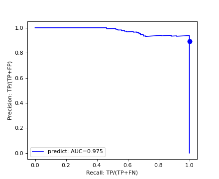
Precision-recall curve
-
hilearn.plot.PR_curve(state, scores, threshold=None, color=None, legend_on=True, legend_label='predict', base_line=False, linewidth=1.5, label=None)[source]¶ Plot Precision-recall curve and calculate the Area under the curve (AUC) from the prediction scores and true labels.
- Parameters
state (array_like, (1, )) – Label state for the ground truth with binary value
scores (array_like, (1, )) – Predicted scores for being positive
threshold (float) – The suggested threshold to add as a dot on the curve
outlier (float) – The proportion of dots as outliers in different color
color (string) – Color for the curve and threshold dot
legend_on (bool) – If True, show the Pearson’s correlatin coefficient in legend
legend_label (string) – The legend label to add, replace of old argument label
base_line (bool) – If True, add the 0.5 baseline as random guess
linewidth (float) – The line width
- Returns
(rec, pre, thresholds, auc) (tuple of values)
rec (array) – Recall values with each threshold
pre (array) – Precision values with each threshold
thresholds (array) – Value of all thresholds
auc (float) – The overall area under the curve (AUC)
Examples
>>> import numpy as np
>>> from hilearn.plot import PR_curve
>>> np.random.seed(1)
>>> score0 = np.random.rand(100) * 0.8
>>> score1 = 1 - 0.4 * np.random.rand(300)
>>> scores = np.append(score0, score1)
>>> state = np.append(np.zeros(100), np.ones(300))
>>> res = PR_curve(state, scores, threshold=0.5, color='blue')
(Source code, png)
Boxgroup plot
-
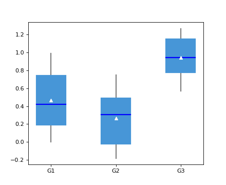
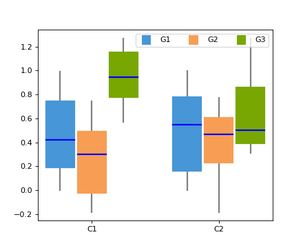
hilearn.plot.boxgroup(x, labels=None, conditions=None, colors=None, notch=False, sys='', widths=0.9, patch_artist=True, alpha=1, **kwargs)[source]¶ Make boxes for a multiple groups data in different conditions.
- Parameters
x (a list of multiple groups) – The input data, e.g., [group1, group2, …, groupN]. If there is only one group, use [group1]. For each gorup, it can be an array or a list, containing the same number of conditions.
labels (a list or an array) – The names of each group memeber
conditions (a list or an array) – The names of each condition
colors (a list of array) – The colors of each condition
notch (bool) – Whether show notch, same as matplotlib.pyplot.boxplot
sys (string) – The default symbol for flier points, same as matplotlib.pyplot.boxplot
widths (scalar or array-like) – Sets the width of each box either with a scalar or a sequence. Same as matplotlib.pyplot.boxplot
patch_artist (bool, optional (True)) – If False produces boxes with the Line2D artist. Otherwise, boxes and drawn with Patch artists
alpha (float) – The transparency: 0 (fully transparent) to 1
**kwargs – further arguments for matplotlib.pyplot.boxplot, e.g., showmeans, meanprops: https://matplotlib.org/stable/api/_as_gen/matplotlib.pyplot.boxplot.html
- Returns
result – The same as the return of matplotlib.pyplot.boxplot
- Return type
dict
Examples
>>> import numpy as np
>>> import matplotlib.pyplot as plt
>>> from hilearn.plot import boxgroup
>>> np.random.seed(1)
>>> data1 = [np.random.rand(50), np.random.rand(30)-.2, np.random.rand(10)+.3]
>>> data2 = [np.random.rand(40), np.random.rand(10)-.2, np.random.rand(15)+.3]
>>> meanprops={'markerfacecolor': 'w', 'markeredgecolor': 'w'}
>>> boxgroup(data1, conditions=("G1","G2","G3"), showmeans=True, meanprops=meanprops)
>>> plt.show()
(Source code, png)

>>> boxgroup([data1, data2], labels=("G1","G2","G3"), conditions=["C1","C2"])
>>> plt.show()
(png)

Styling
Setting fonts
-
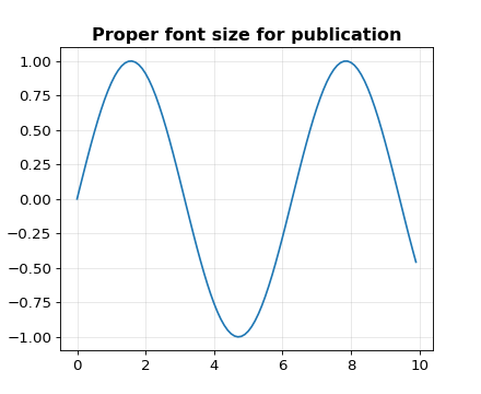
hilearn.plot.set_style(label_size=12, grid_alpha=0.3)[source]¶ Set the figure style on fontsize for ticks, label, title and legend :param label_size: The size for labels, and proportional to ticks, legend, and title :type label_size: float :param grid_alpha: The transparency of grid with value from 0 (fully transparent) to 1 :type grid_alpha: float
Examples
>>> import numpy as np
>>> import matplotlib.pyplot as plt
>>> from hilearn.plot import set_style
>>> set_style(label_size=12, grid_alpha=0.3)
>>> plt.plot(np.arange(0, 10, 0.1), np.sin(np.arange(0, 10, 0.1)))
>>> plt.title("Proper font size for publication")
(Source code, png)

Setting frame
-
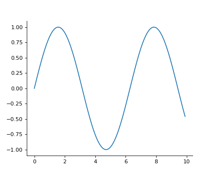
hilearn.plot.set_frame(ax, top=False, right=False, bottom=True, left=True)[source]¶ Example of setting the frame of the plot box.
- Parameters
ax (matplotlib Axes) – The Axes object containing the plot
top (bool) – If True, keep the frame
right (bool) – If True, keep the frame
bottom (bool) – If True, keep the frame
left (bool) – If True, keep the frame
Examples
>>> import numpy as np
>>> import matplotlib.pyplot as plt
>>> from hilearn.plot import set_frame
>>> ax = plt.subplot(1, 1, 1)
>>> plt.plot(np.arange(0, 10, 0.1), np.sin(np.arange(0, 10, 0.1)))
>>> set_frame(ax, top=False, right=False, bottom=True, left=True)
(Source code, png)
Setting colors
-
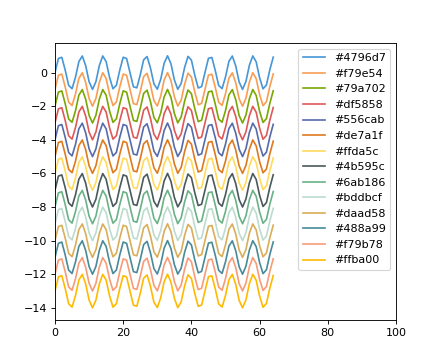
hilearn.plot.set_colors(color_list=['#4796d7', '#f79e54', '#79a702', '#df5858', '#556cab', '#de7a1f', '#ffda5c', '#4b595c', '#6ab186', '#bddbcf', '#daad58', '#488a99', '#f79b78', '#ffba00'])[source]¶ Replace the color list in matplotlib color_cycle
Examples
>>> import hilearn
>>> import numpy as np
>>> import matplotlib.pyplot as plt
>>> _colors = hilearn.plot.set_colors(hilearn.plot.hilearn_colors)
>>> xx = np.arange(65)
>>> for i in range(14):
>>>     plt.plot(xx, np.sin(xx)-i, label="%s" %_colors[i])
>>> plt.legend()
>>> plt.xlim(0, 100)
>>> plt.show()
(Source code, png)